Hero Image
UCare

UCare is a nonprofit health plan serving members across Minnesota and western Wisconsin. Loved by current members yet overlooked by the broader market, the brand suffered from low awareness, misconceptions about who it served, and a visual identity that no longer reflected the warmth and inclusivity of its mission. In a category dominated by cold corporate giants, UCare needed to show the world the real people and teamwork behind its human centered approach to care.

The objective was to modernize the brand and create a friendly, distinctive identity that felt welcoming to new members while honoring the trust UCare had built over decades. We focused on the qualities that truly set UCare apart: their advocacy, their community partnerships, and the genuine dedication of the people who go the extra mile for members every day.
Caption text lorem ipsum
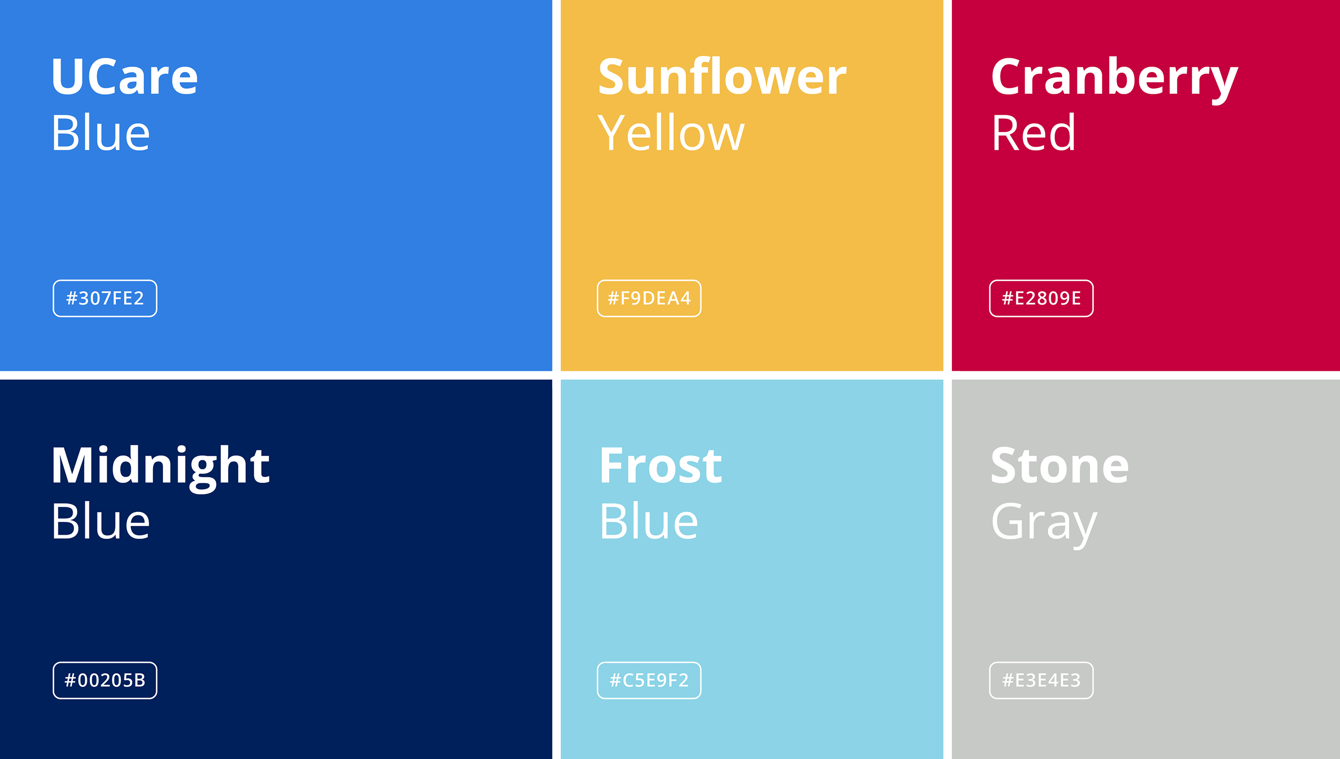
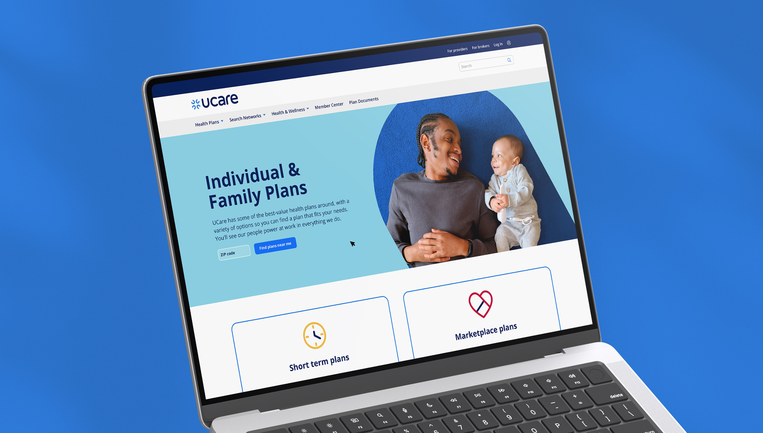
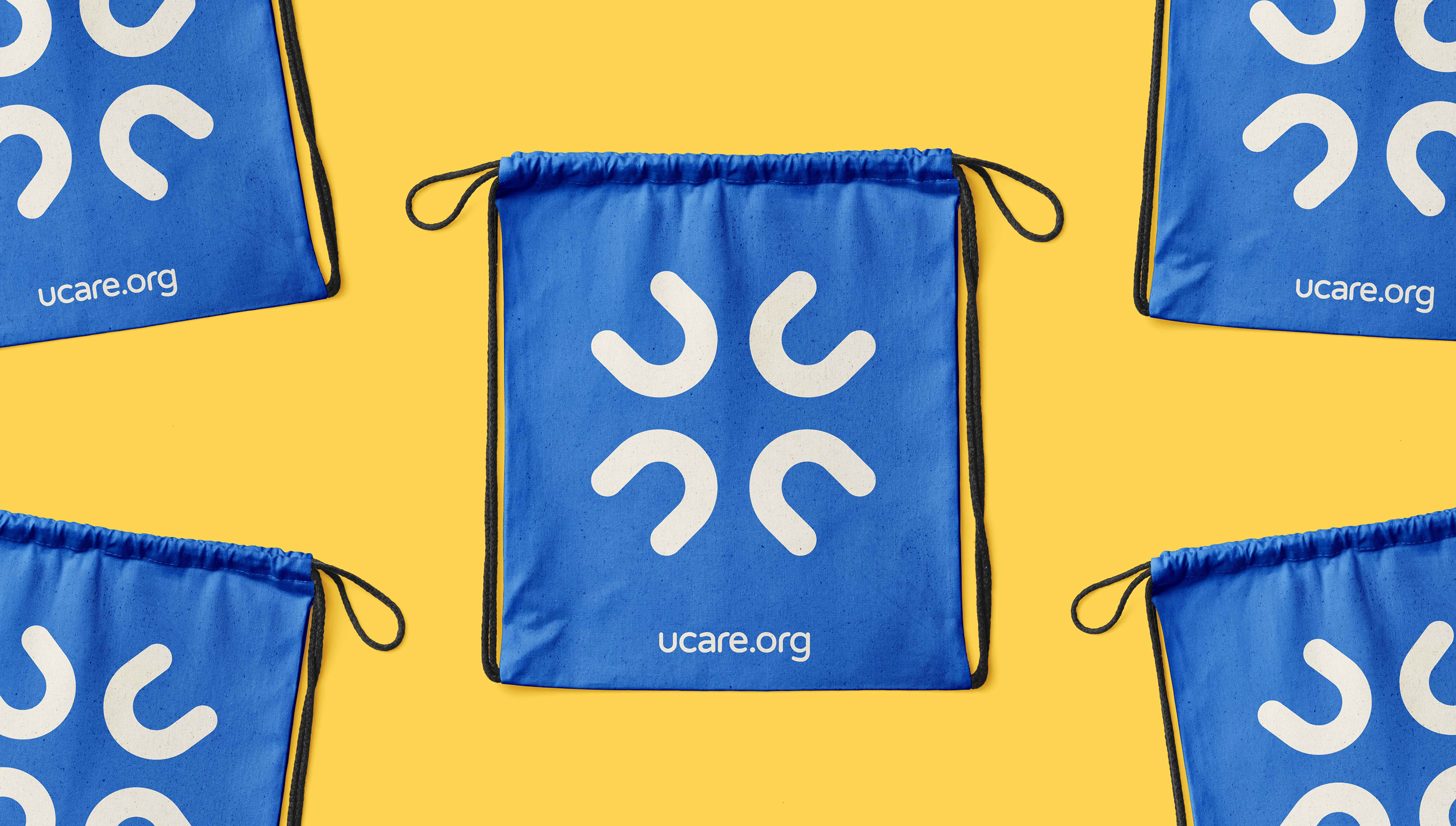
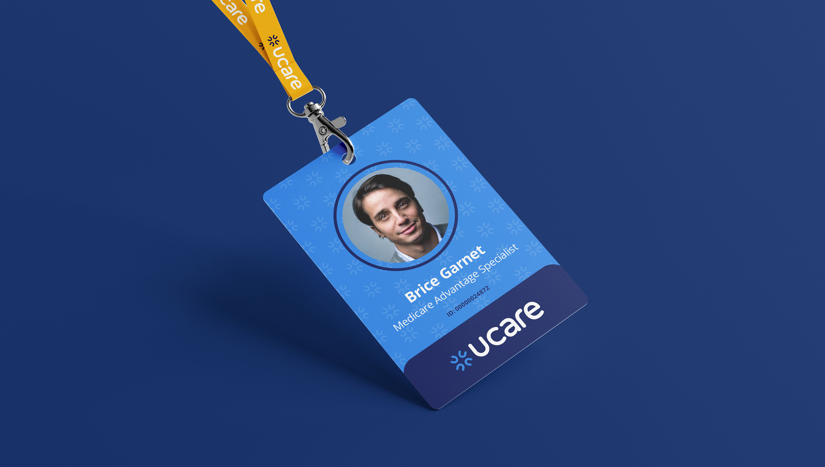
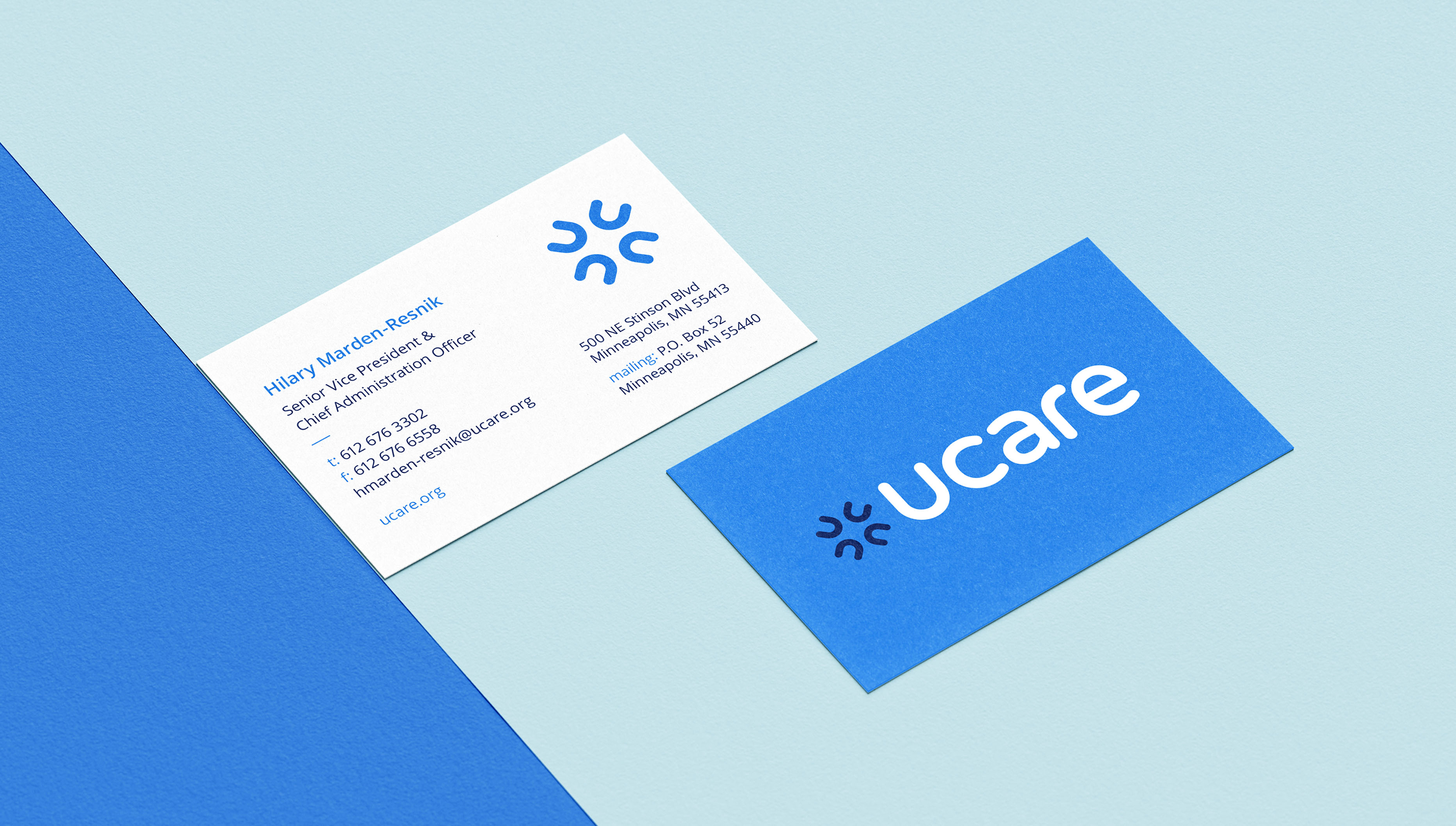
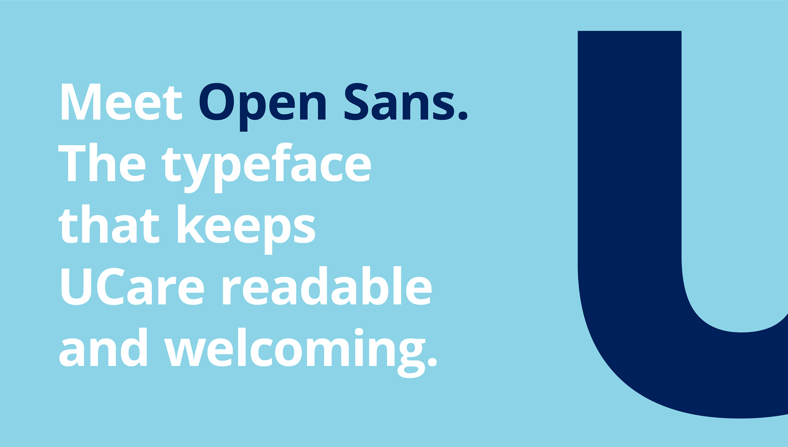
We refreshed UCare’s visual identity with a modern, human centered logo, supported by updated typography and a flexible design system built around energy and inclusivity. A new spark icon became a symbol of teamwork and momentum, unifying communications across audiences and giving the brand a clear, contemporary point of view. The updated identity and campaign contributed to significant growth in the first year, including more than 34,000 new members.
The result is a brand that feels more human, more welcoming, and more reflective of the care UCare brings to every member it serves.
Caption text lorem ipsum